Daily Burn approached us for help refining their positioning and identity as they transitioned into a mature brand with mass appeal. We focused their strategy and initiated a ground-up redesign that would change the way the company and its customers interact.
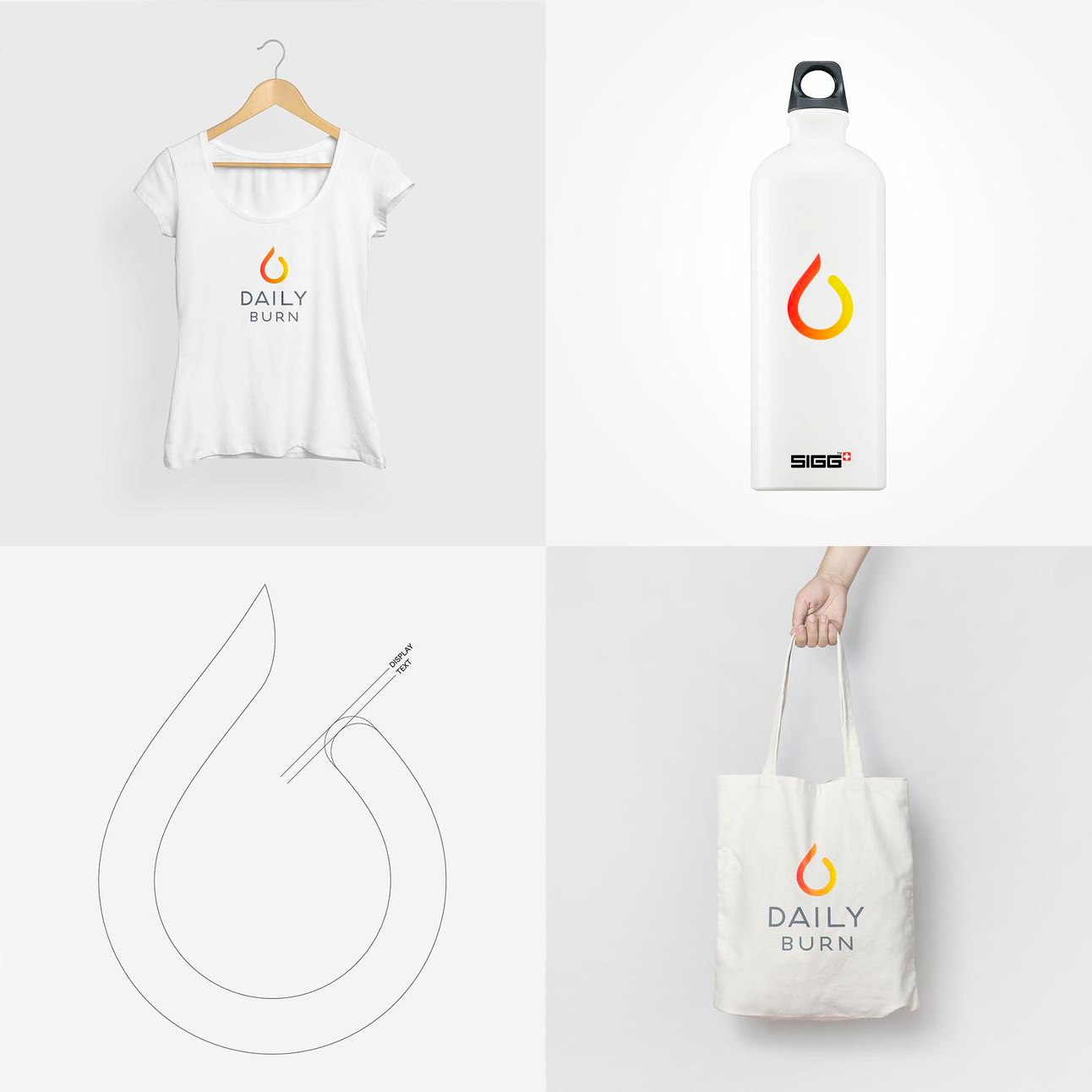
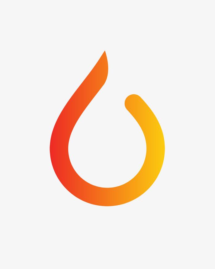
We wanted to create an optimistic sensibility that was accessible to all; to make fitness fun and unintimidating. Not hard bodies, but healthier living. The flame form, in its simple gradated orange, suggests measurable progress, self-improvement and momentum; "A Better Fit" was the winning tagline, implying a program that works with your lifestyle: progress, not perfection.
We wanted to create an optimistic sensibility that was accessible to all; to make fitness fun and unintimidating. Not hard bodies, but healthier living. The flame form, in its simple gradated orange, suggests measurable progress, self-improvement and momentum; "A Better Fit" was the winning tagline, implying a program that works with your lifestyle: progress, not perfection.
We created a modular package of show graphics and audio mnemonics for the broadcast content, beginning with the company's new livestreamed studio show, Daily Burn 365, combining live action elements and animated typography.
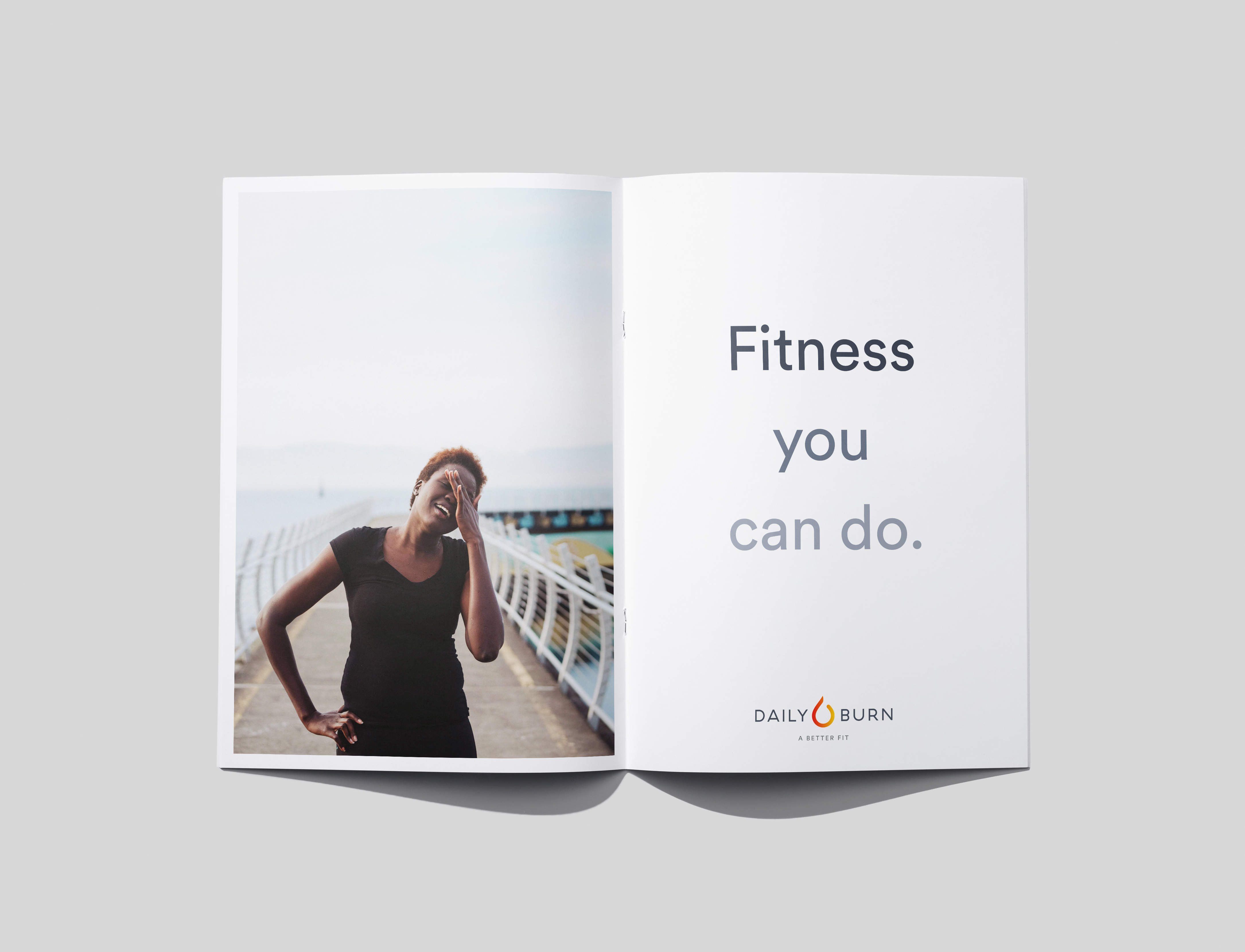
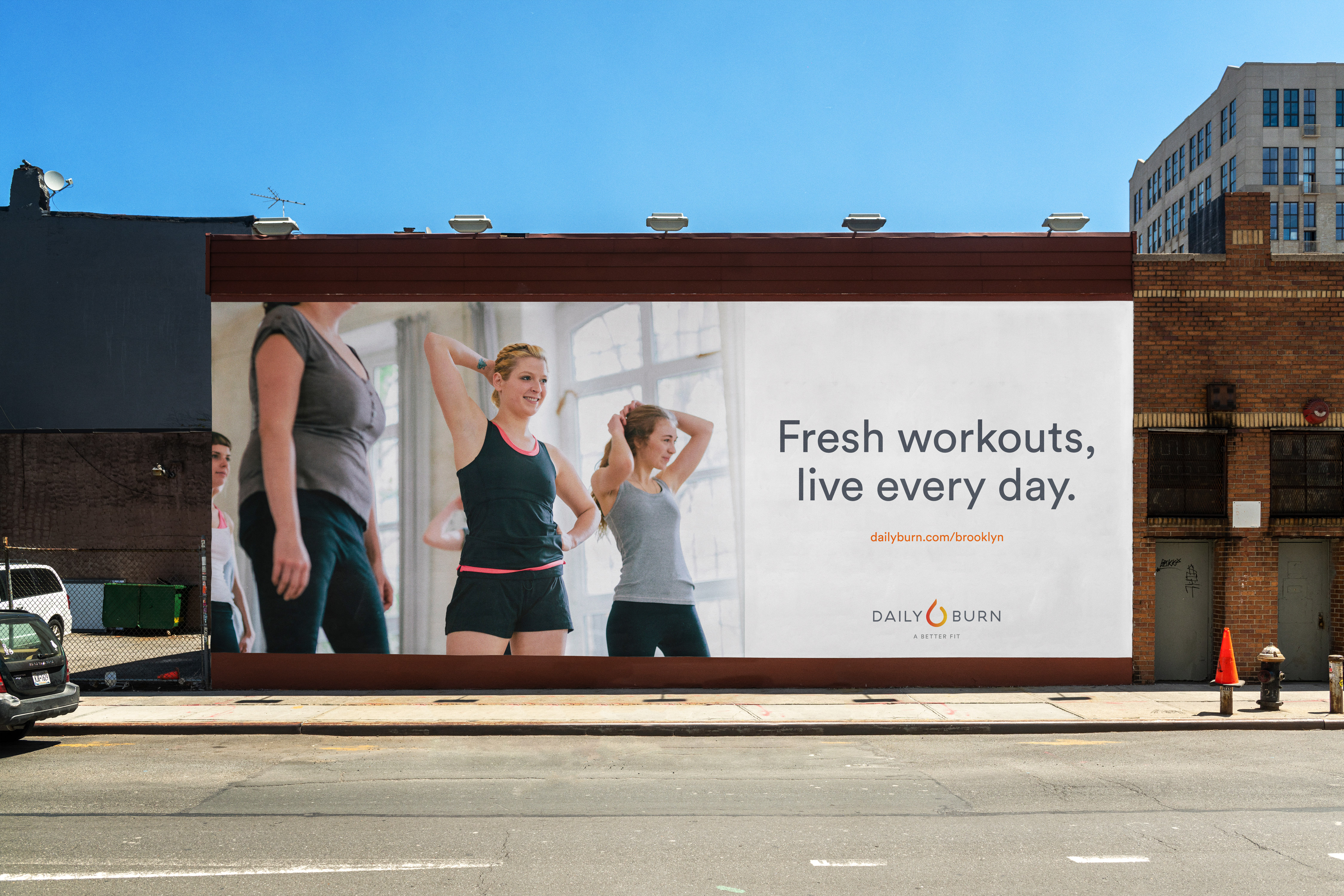
To roll out the new system, we created style guides and a printed brand book to help orient employees with the new direction. Our work informed every aspect of brand integration, from casting and photography for advertising campaigns, to set design and lighting direction for the Daily Burn show. The system would eventually grow to integrate brand communications and direct sales tools.
![]()

